CASE STUDY: Vietnam E-Visa Redesign
SELF-INITIATED CONCEPT PROJECT
The Vietnamese e-visa system is genuinely useful — but the official website makes it far harder than it needs to be. As a traveller who used it firsthand, I identified a clear UX problem worth solving and redesigned the full application experience from the ground up as a self-initiated concept project.
RESEARCH
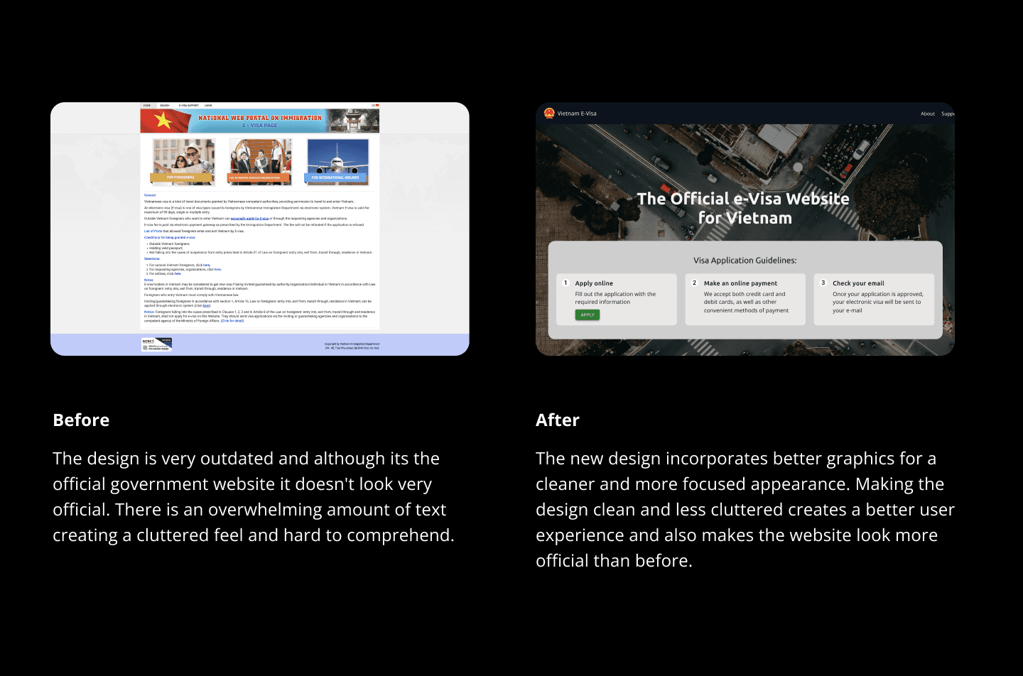
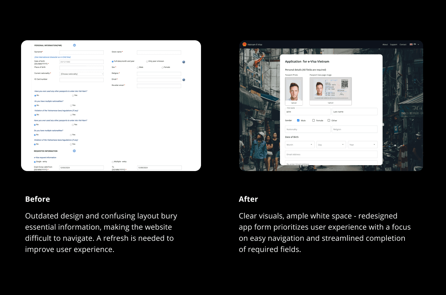
I mapped the existing site's full structure — every element, every user action, every point of friction. The audit revealed a consistent pattern: unclear navigation hierarchy, text-heavy forms with no visual relief, and a design aesthetic that actively undermined trust at exactly the moment users needed to feel secure submitting personal information.
DESIGN
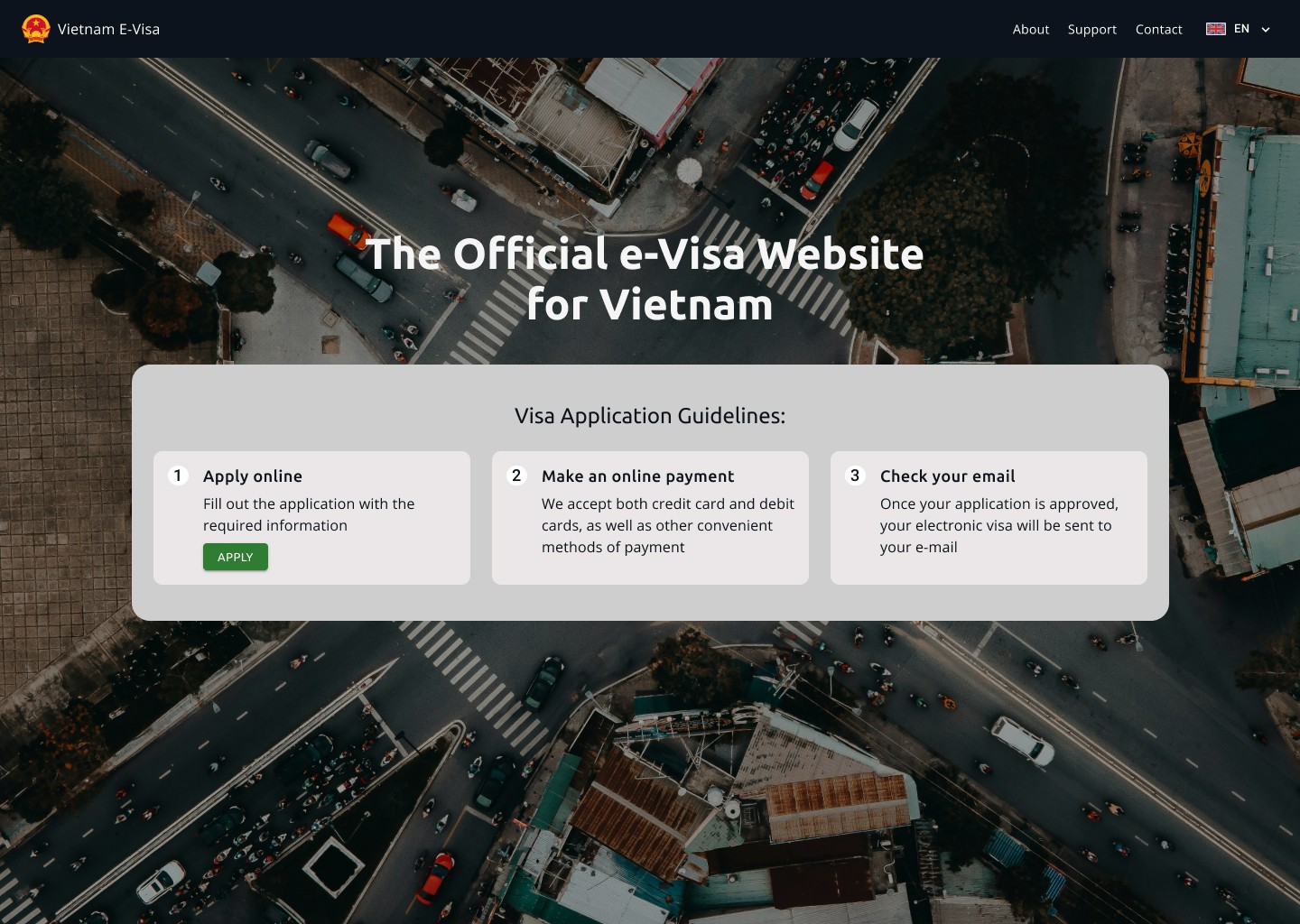
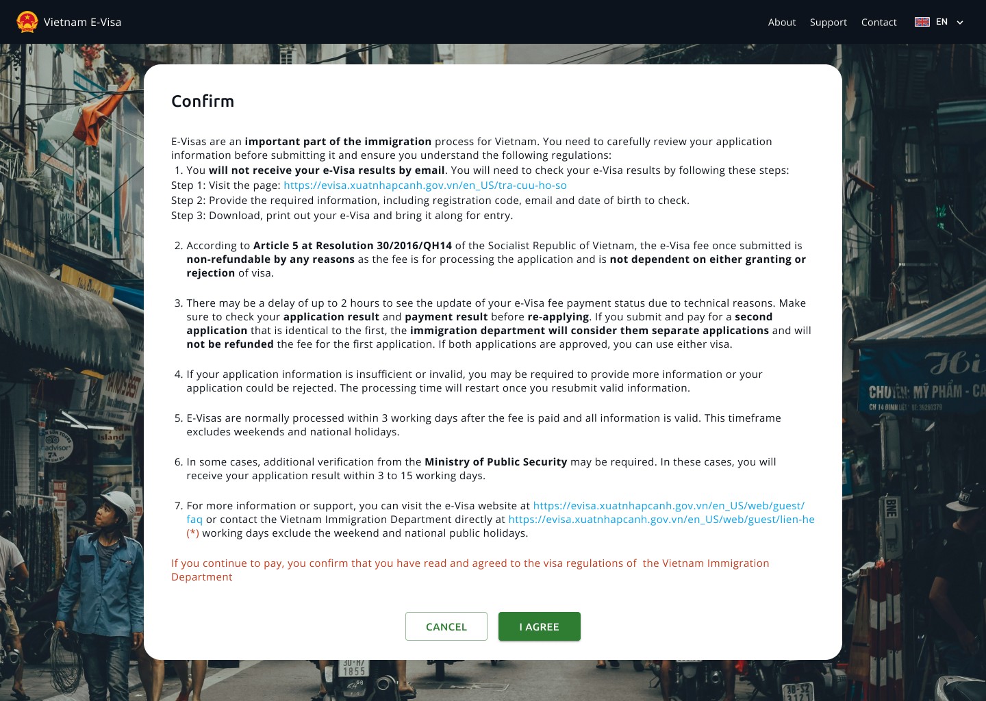
I prioritized user needs for the redesign of Vietnam's e-visa website. Identified pain points included overly complex forms for tech-savvy travelers and unclear instructions for novice travelers. By combining these user insights with Vietnam's government regulations, I crafted a user-friendly and compliant website. This involved designing a clear and intuitive interface, simplifying forms, and providing helpful guidance throughout the application process, ensuring a smooth and efficient e-visa application experience for all travelers. This resulted in a significant improvement in the user experience and a more efficient e-visa application process.
KEY AUDIT INSIGHTS
UX complexity causes user errors and lost data — Navigation hierarchy is unclear, with confusing nesting throughout — Common tasks take too long and are buried — Text overload across the system where visuals and iconography would serve users better — Overly technical aesthetic undermines visual credibility and trust
CHALLENGES
The core design challenge was balancing two very different user types — confident, tech-savvy travellers who want to move fast, and first-time applicants who need guidance at every step. A single form flow had to serve both without overwhelming one or patronising the other. The secondary challenge was rebuilding trust: the existing site's outdated aesthetic made users hesitant to submit passport details and personal information, so visual credibility had to be established from the first screen.
WIREFRAMING & PROTOTYPING
I mapped the existing site's full information architecture before touching any UI — identifying every inconsistency in the flow. From there, low-fidelity wireframes defined the new structure, simplifying the application into clear, logical steps before moving into high-fidelity design in Figma.
USER EXPERIENCE
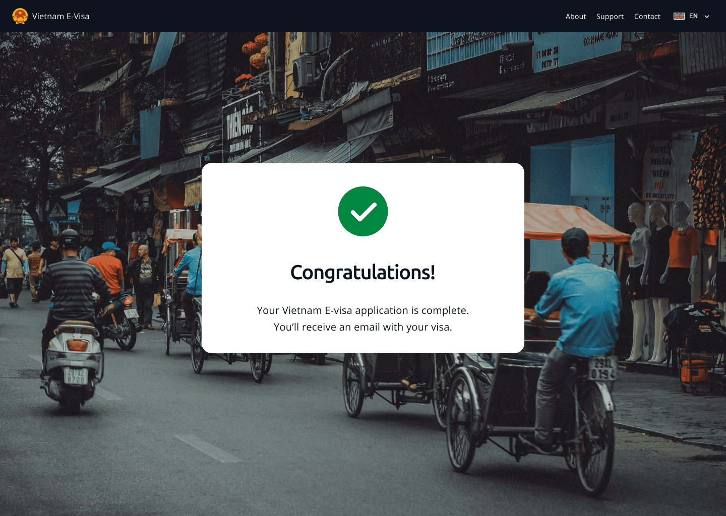
The redesigned flow replaces text-heavy forms with clear visual hierarchy, iconography, and step-by-step guidance that reduces cognitive load at every stage. The result is an application process that feels trustworthy, fast, and navigable for users of any technical background or language level.
SUMMARY
A self-initiated redesign of a genuinely broken government UX — from audit through to Figma prototype. The project demonstrates a full UX process: audit, information architecture, wireframing, and high-fidelity design, applied to a real-world system used by millions of travellers. The interactive prototype is available to view via the link above.