CASE STUDY: Alexandra Kesler
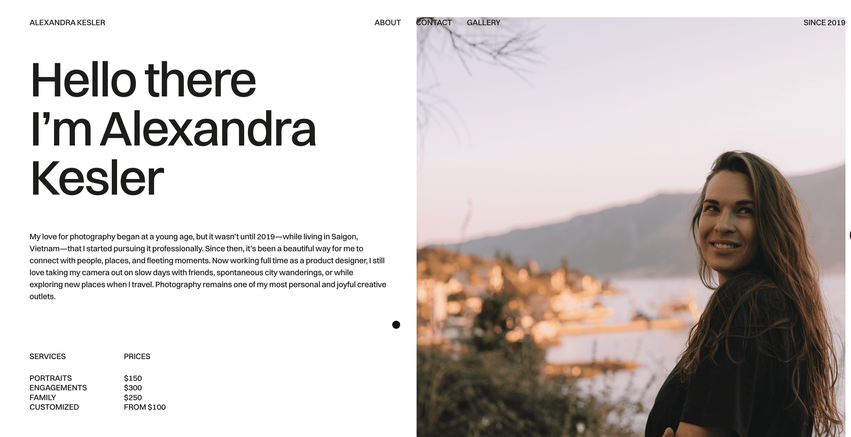
Alexandra Kesler is a photographer specialising in brand campaigns. She needed a portfolio site as intentional as her work — minimal, immersive, and built to grow with her. I designed and built the full site in Framer, creating a gallery-like experience that lets her photography lead while giving potential clients everything they need to reach her. The site is live at alexandrakesler.framer.website.
RESEARCH
I started by understanding Alexandra's photography style, her target clients, and what she wanted visitors to feel on arrival. Alongside conversations with her about creative direction and inspiration, I analysed contemporary photography portfolios to identify what felt fresh versus what felt overdone — shaping a direction that was personal, timeless, and distinctly hers.
DESIGN
The design needed to feel like an extension of Alexandra’s visual world—calm, curated, and quietly powerful. I leaned into a minimal layout with generous white space, soft transitions, and a muted palette that allowed her photos to shine. Every design element, from the typography to the image spacing, was carefully considered to support a fluid, gallery-like experience that felt intuitive and immersive rather than flashy.
INSIGHTS & CHALLENGES
Testing revealed that visitors stayed longer when images were revealed with intention rather than all at once — so I structured the gallery around a gentle scroll rhythm rather than a paginated approach. The main design challenge was finding the balance between simplicity and depth: Alexandra's work is emotional and layered, so the site couldn't be sterile. It had to hold space for the feeling behind the images without competing with them.
DECISIONS
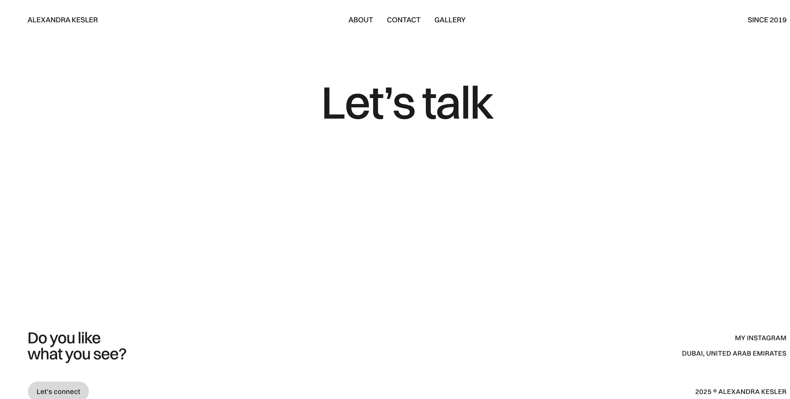
Alexandra wanted her images to speak for themselves — but visitors unfamiliar with her work still needed context. The solution was a restrained About section with just enough personality to establish trust, paired with a contact form designed to feel like a natural part of the flow rather than a separate destination. Framer's CMS was central to the build, giving Alexandra full control to update galleries independently without any technical help.
USER EXPERIENCE
The site guides visitors naturally — from first impression through to contact — without ever feeling like it's pushing them anywhere. Fully responsive across all devices, with mobile layouts that preserve the same sense of space and calm as the desktop experience.
SUMMARY
The site launched as a complete digital home for Alexandra's work — minimal, elegant, and built to grow with her. It functions as both a portfolio and a client acquisition tool, presenting her photography in a context that earns trust and makes it easy to get in touch. A project where restraint was the hardest and most important design decision.