CASE STUDY: OxiBotanica
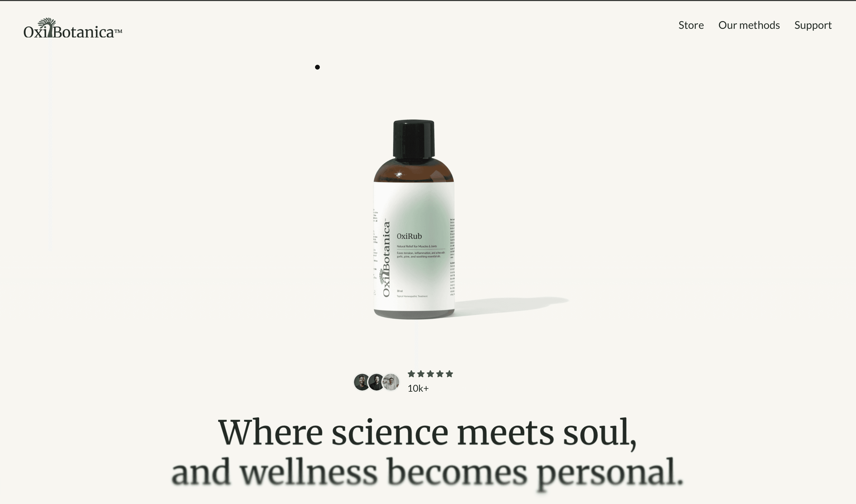
OxiBotanica is a botanical wellness brand combining clinical research and natural ingredients. I led the full project — brand identity, logo, packaging, and end-to-end UX/UI for the e-commerce platform — designing a system that balances scientific credibility with emotional warmth.
DISCOVERY
The brand needed to harmonize science and emotion — credible enough to earn trust, warm enough to feel personal. Every element, from logo to website flow, was designed to evoke calm, inspire confidence, and make wellness feel intuitive and beautifully simple.
TARGET AUDIENCE
Health-conscious individuals seeking natural remedies backed by science — people who value transparency, quality, and ease. Research confirmed a shift in the wellness market away from purely clinical or purely "natural" aesthetics toward brands that balance both. This guided OxiBotanica's focus on clarity, harmony, and a simplified supplement experience.
BRAND IDENTITY
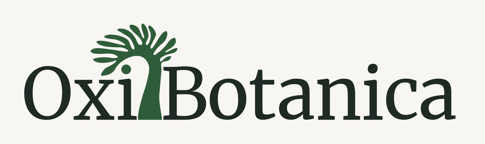
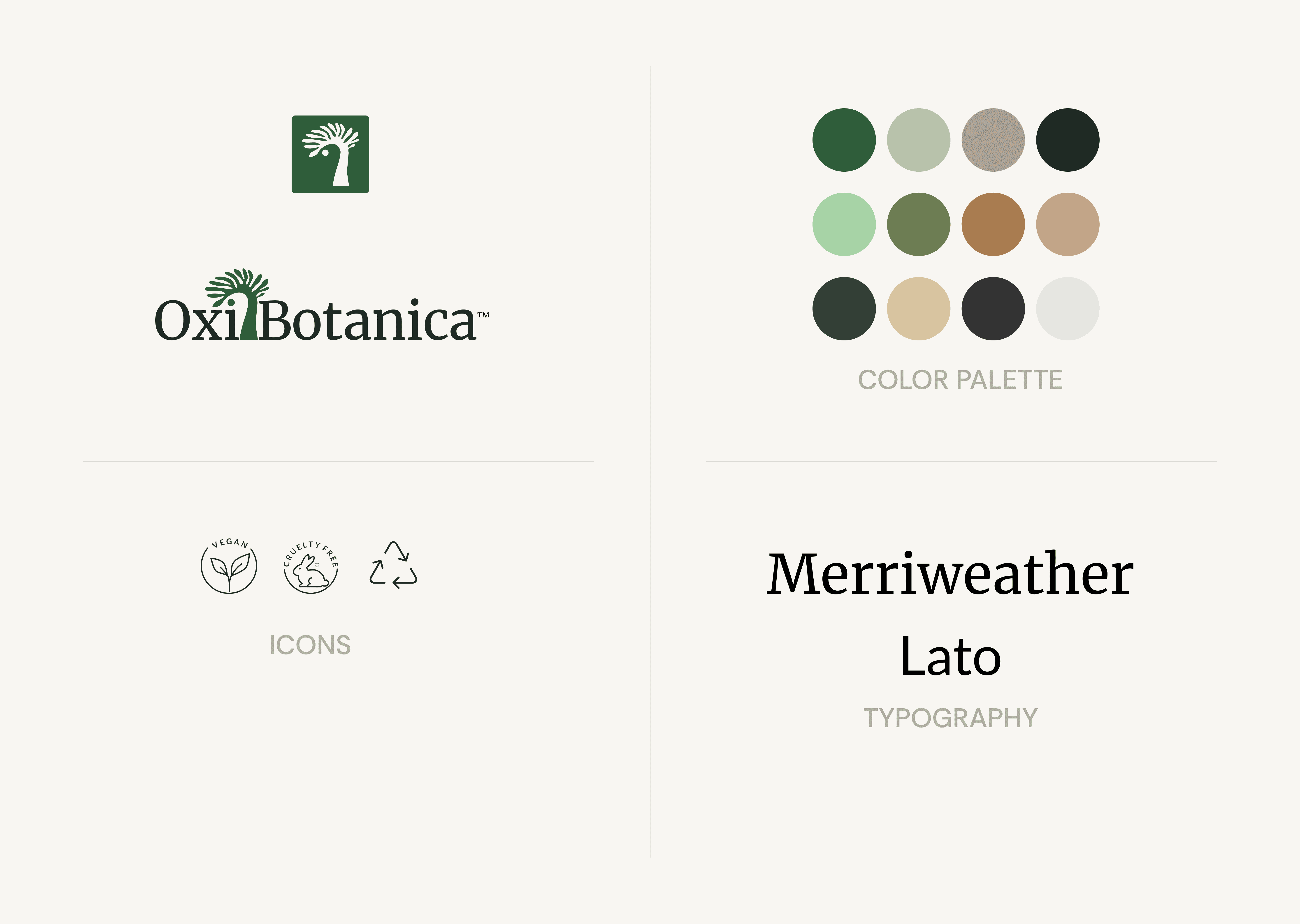
Logo Concept: The primary mark integrates the “O” in Oxi with a stylized botanical form, evoking both a flourishing plant and an uplifting breath of life. Its upward-reaching, organic lines symbolize vitality, growth, and the brand’s deep connection to nature. Paired with the clean, modern wordmark, it creates a harmonious balance between natural wellness and scientific credibility, while remaining versatile for use across packaging and digital touchpoints.
PACKAGE DESIGN
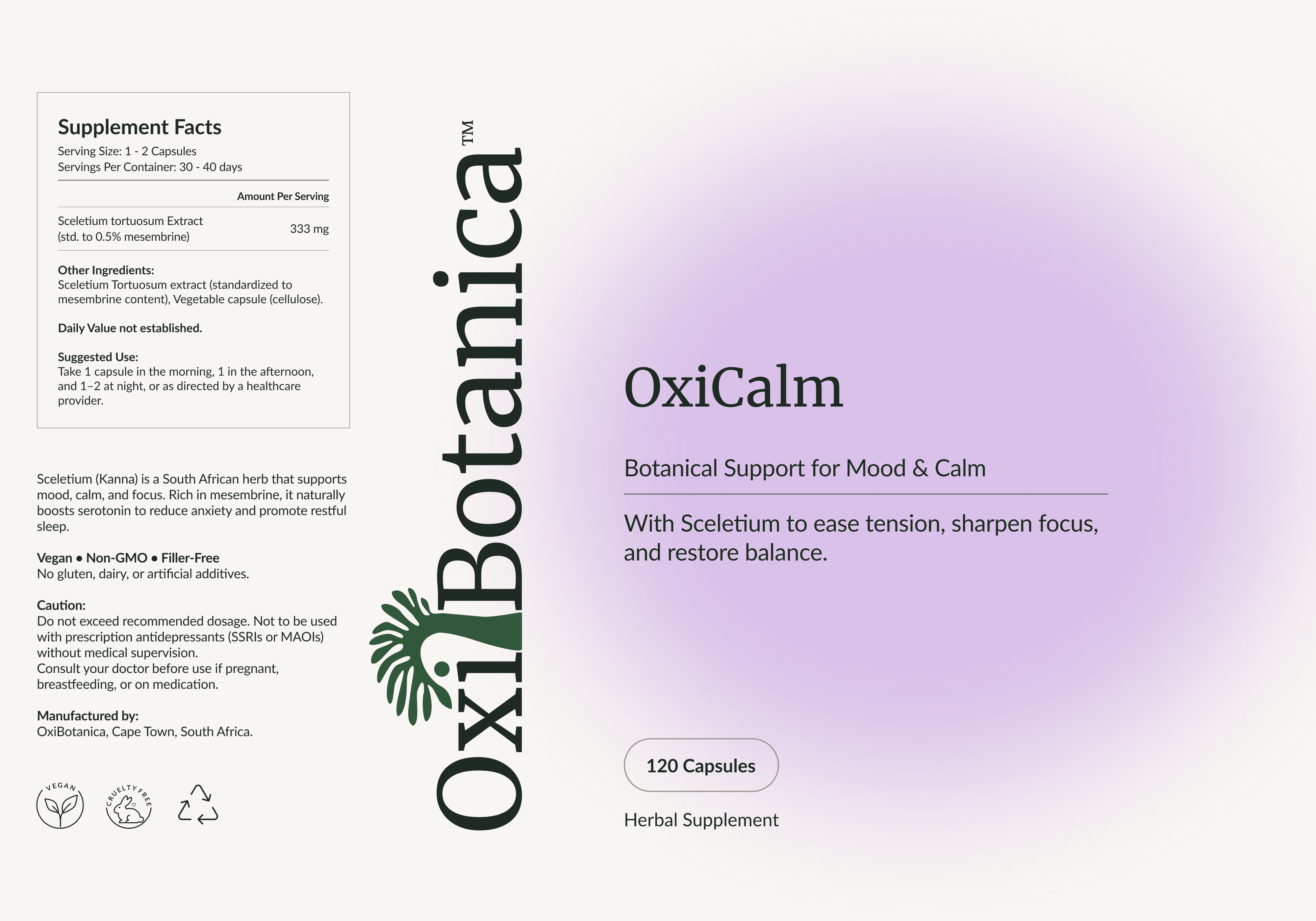
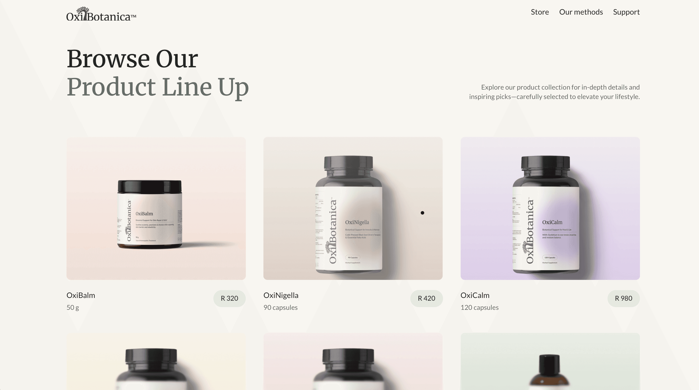
Every product label follows a clear hierarchy, starting with the product name, followed by its key benefit, and then a short supporting description. For example, Oximune is presented as a botanical blend for immune resilience, with the line “Formulated to modulate the immune system, support gut health, and restore balance.” The visual design incorporates minimal herbal illustrations, such as moringa leaves and sceletium stems, alongside soft gradients to suggest flow and vitality, and an icon system to highlight product benefits like immune support, sleep, energy, and mood.
CHALLENGES
USER EXPERIENCE
User-friendliness was central to the redesign, focusing on clarity, calm, and ease of navigation. The website’s structure was simplified so users could quickly find blends that matched their needs, supported by consistent layouts, clear hierarchy, and gentle interactions. Visual cues, benefit icons, and concise product descriptions made information easy to absorb, while responsive design and a guided wellness quiz ensured a seamless experience across all devices.
SUMMARY
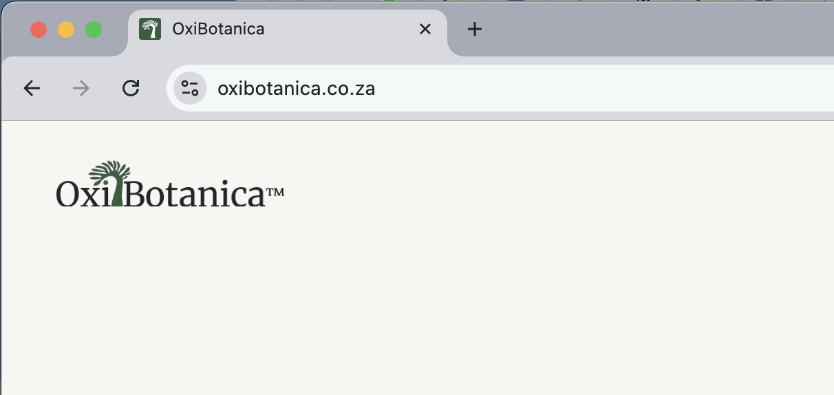
The full brand system — identity, packaging, and e-commerce experience — was delivered and launched at oxibotanica.co.za. The project covered every touchpoint from logo to checkout, creating a consistent, premium experience that positions OxiBotanica confidently in the modern wellness market.